Logos are more than just symbols; they are the visual identity of a brand. Have you ever wondered why certain logos make you feel a certain way? Why does red make you feel excited, while blue evokes trust? The Psychology Behind Logos is a fascinating blend of colour theory, shape psychology, and branding strategies. In this article, we’ll explore how colours and shapes influence consumer perception and why businesses should pay close attention to their logo design. Understanding the Psychology Behind Logos can help brands create a powerful and lasting impact on their audience.
1. The Power of Colors in Logos
Colours play a crucial role in how a brand is perceived. Different colours evoke different emotions and responses. Understanding the psychology of colours can help businesses choose the right shades to convey their message effectively.
Red – Passion, Energy, and Urgency
Red is the colour that grabs attention. It creates a sense of urgency, which is why it is commonly used in clearance sales and fast-food branding.
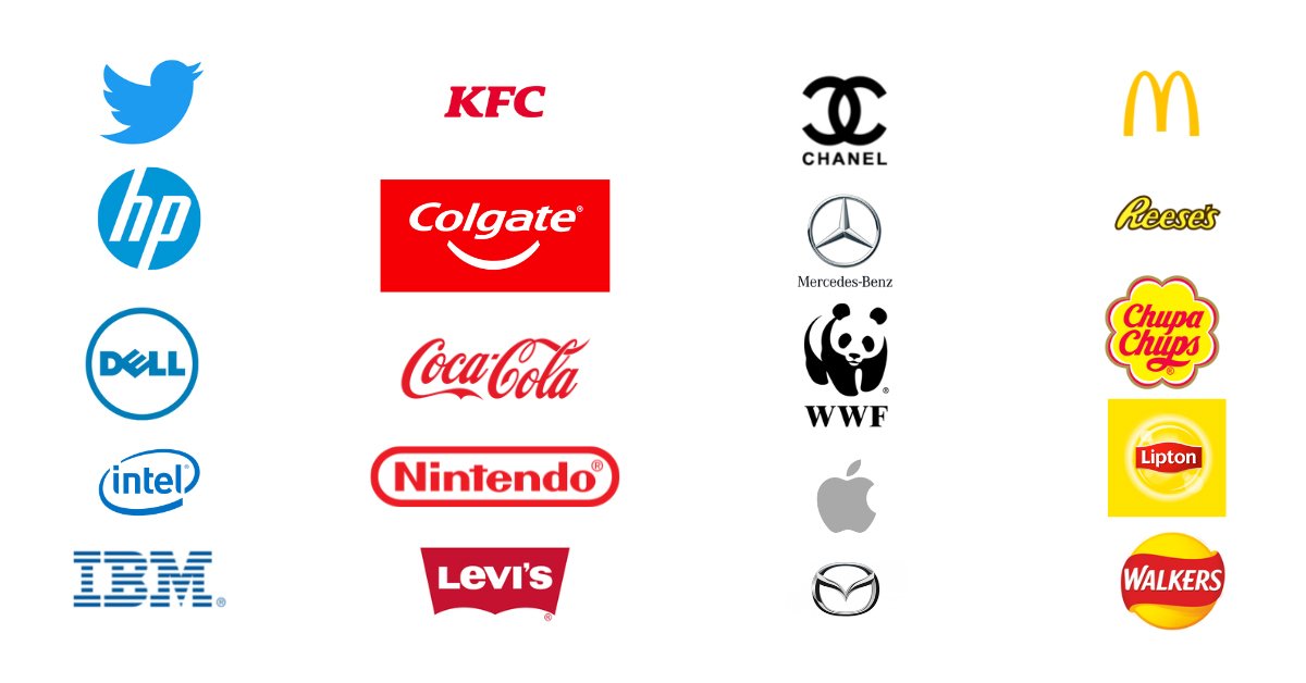
✔ Examples: Coca-Cola, YouTube, KFC
✔ Best for: Food brands, entertainment, retail, and call-to-action elements
Blue – Trust, Security, and Professionalism
Blue is a colour colour of trust and dependability. That’s why banks, tech companies, and healthcare brands often use it.
✔ Examples: Facebook, PayPal, IBM
✔ Best for: Finance, healthcare, technology, and corporate brands
Yellow – Optimism, Happiness, and Clarity
Yellow represents positivity and warmth. It’s an eye-catching colour that creates a sense of happiness and friendliness.
✔ Examples: McDonald’s, Snapchat, IKEA
✔ Best for: Food industry, travel, and lifestyle brands
Green – Nature, Growth, and Sustainability
Green is associated with nature, health, and balance. It is widely used in organic, eco-friendly, and wellness brands.
✔ Examples: Starbucks, Whole Foods, Animal Planet
✔ Best for: Environmental, wellness, and finance industries
Black – Elegance, Luxury, and Power
Black represents sophistication and authority. Many luxury brands use black to create a sleek, premium feel.
✔ Examples: Chanel, Nike, Apple
✔ Best for: High-end fashion, tech, and premium brands
Purple – Royalty, Creativity, and Imagination
Purple is linked to luxury, creativity, and wisdom. It’s a great choice for brands that want to appear unique and visionary.
✔ Examples: Cadbury, Hallmark, Yahoo
✔ Best for: Beauty, luxury, and creative industries
Orange – Playfulness, Energy, and Fun
Orange creates excitement and enthusiasm. It is often used by brands that want to be seen as approachable and fun.
✔ Examples: Nickelodeon, Fanta, Harley-Davidson
✔ Best for: Entertainment, beverages, and sports
White & Grey – Simplicity and Modernity
White and grey provide a clean, minimalist look. They are commonly used to convey professionalism and neutrality.
✔ Examples: Apple, Tesla, Mercedes-Benz
✔ Best for: Technology, automotive, and corporate brands
2. The Psychology of Logo Shapes
Just like colours, shapes in a logo influence consumer perception. Different shapes create different emotional responses.
Circles & Ovals – Community, Unity, and Endurance
Circular logos give a sense of community and inclusivity. They often feel softer and friendlier.
✔ Examples: Pepsi, Starbucks, BMW
✔ Best for: Social, food, and automobile brands
Squares & Rectangles – Stability, Strength, and Trust
Squares and rectangles provide a sense of order and security. They convey professionalism and reliability.
✔ Examples: Microsoft, American Express, BBC
✔ Best for: Corporate, finance, and tech industries
Triangles – Power, Direction, and Innovation
Triangles are associated with progress and movement. They often symbolize energy and leadership.
✔ Examples: Adidas, Mitsubishi, Google Play
✔ Best for: Tech, sports, and engineering brands
Abstract Shapes – Creativity and Uniqueness
Some logos use abstract symbols to create a distinctive and memorable brand identity.
✔ Examples: Nike (Swoosh), Airbnb, Spotify
✔ Best for: Creative and modern brands
3. Branding: Why Logo Design Matters
A logo is the face of a brand. It is often the first thing customers notice, making it a crucial branding element.
✔ Logos Build Brand Recognition
A well-designed logo helps customers remember and recognize a brand instantly. Think of Apple’s bitten apple or McDonald’s golden arches—iconic and unforgettable!
✔ Logos Create Emotional Connections
People associate brands with emotions. A thoughtful logo design helps build trust, excitement, or loyalty, depending on its colours and shapes.
✔ Logos Differentiate Your Brand from Competitors
Your logo is a unique identity that sets your brand apart in a crowded market. A strong logo gives your business a competitive edge.
4. How to Choose the Right Logo for Your Brand
- Define Your Brand Personality – Is your brand playful, professional, luxurious, or eco-friendly?
- Select Colors That Align With Your Message – Use color psychology to match your brand’s personality.
- Choose the Right Shapes – Circles for inclusivity, squares for stability, or triangles for innovation.
- Keep It Simple Yet Memorable – Overcomplicated logos can be confusing. Simplicity is key.
- Test Your Logo Across Different Platforms – Ensure it looks good on websites, social media, and packaging.
Conclusion
A logo is not just a design; it’s a powerful tool that influences how people perceive your brand. Psychology Behind Logos By understanding the psychology behind colours, shapes, and branding, businesses can create logos that leave a lasting impression.