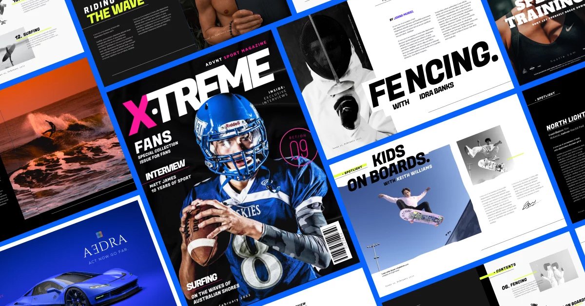
Magazine design layouts are an intricate blend of creativity and strategy, ensuring visual appeal while maintaining readability. A well-designed magazine captivates readers, enhances content flow, and strengthens brand identity. Here’s how you can create stunning magazine layouts that engage and inspire.
1. Understanding the Basics of Magazine Design
Before diving into the design process, it’s essential to understand the key principles that define a successful magazine layout.
Key Elements:
- Grid System: Helps maintain structure and alignment.
- Typography: Enhances readability and aesthetics.
- Colour Scheme: Creates mood and brand consistency.
- White Space: Prevents clutter and improves focus.
2. Choosing the Right Layout Style
Different styles cater to different magazine genres. Whether designing for fashion, business, or entertainment, selecting the right layout style enhances the reading experience.
Popular Layout Styles:
- Minimalist Layout: Clean, simple, and modern.
- Grid-Based Layout: Balanced and structured.
- Layered Layout: Overlapping elements for a dynamic look.
- Typographic Layout: Bold and text-focused.
3. Using High-Quality Imagery
Compelling visuals are crucial in magazine design. High-resolution images, engaging illustrations, and well-placed graphics enhance storytelling.
Tips for Effective Imagery:
- Use high-resolution images (300 DPI for print).
- Align visuals with the magazine’s theme.
- Maintain a balance between text and images.
4. Typography and Readability
Typography plays a vital role in setting the tone and style of a magazine. Choosing the right fonts and text hierarchy improves readability and engagement.
Best Practices:
- Limit font choices to two or three complementary fonts.
- Use hierarchy to differentiate headings, subheadings, and body text.
- Ensure sufficient contrast between text and background.
5. Balancing Text and White Space
White space, or negative space, is essential in magazine design. It enhances readability, reduces clutter, and creates a visually pleasing composition.
How to Use White Space Effectively:
- Avoid overcrowding pages with text.
- Use margins and padding strategically.
- Allow breathing room between elements.
6. Creating a Cohesive Color Palette
A consistent colour scheme enhances brand identity and visual harmony. Selecting the right colours evokes emotions and improves readability.
Colour Tips:
- Stick to a primary and secondary colour palette.
- Use contrasting colours for emphasis.
- Maintain brand consistency throughout the magazine.
7. Designing Engaging Covers
The magazine cover is the first impression readers get. A striking cover design should grab attention and reflect the magazine’s content.
Elements of a Great Cover:
- Bold, readable headlines.
- Eye-catching imagery.
- Strategic placement of text and visuals.
Final Thoughts
Creating stunning magazine design layouts requires a balance of creativity, functionality, and attention to detail. Magazine design layouts help in organizing content effectively and ensuring a smooth reading experience. By following these design principles, you can craft visually appealing magazines that engage readers and strengthen your brand’s presence.
